
Neutral Colours vs. Bold Colours: Finding the Right Balance in Your Closet
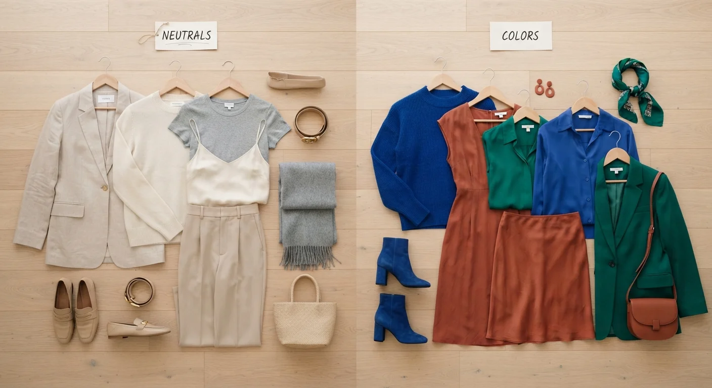
Photo credit: TopInfoTabs.com | Easy Insights For Inspiration
In this article
Weigh the everyday practicality of neutrals against the personality of bold colour choices to find a palette that genuinely works for your lifestyle.
Key Takeaways
- Neutrals build versatile foundations that reduce daily decision fatigue and stretch your wardrobe further.
- Bold colours communicate personality and mood, and can lift your energy when worn intentionally.
- Most people benefit from a blend - anchoring outfits in neutrals while using bold pieces as accents.
- Your lifestyle, skin undertone, and personal comfort level all inform the right colour ratio for you.
- Neither approach is superior - the best palette is the one you actually wear with confidence.
What Each Colour Approach Actually Offers
Neutrals - think ivory, beige, camel, grey, navy, black, and white - earn their wardrobe staple status for practical reasons. They recede visually, which means they never compete with other pieces. Two neutral garments almost always work together without clashing, making them ideal anchors for a mix-and-match system. For people navigating varied daily demands - office, errands, social plans - this flexibility is genuinely valuable.
Bold colours work differently. A cobalt blazer, a terracotta midi skirt, or a saturated emerald blouse carries communicative power. Colour psychology research generally supports the idea that colour affects both how we feel in our clothes and how others initially perceive us - though the effect is nuanced and personal. Bold colours invite attention and signal intentionality. They can also elevate your mood on a flat morning, making the act of getting dressed feel rewarding rather than routine.
Neither camp has a monopoly on style. The question is how each fits into your real life. For deeper thinking on this, see our guide to intentional dressing.
| Criterion | Neutral Colours | Bold Colours |
|---|---|---|
| Outfit versatility | Very high - pairs with almost anything | Moderate - needs careful pairing |
| Self-expression potential | Subtle, communicated through texture and fit | High - immediately visible and communicative |
| Seasonal staying power | Consistently relevant across seasons | Some shades trend cyclically |
| Cost-per-wear value | High - worn frequently and broadly | Varies - depends on how often it fits occasions |
| Morning decision effort | Low - most combinations work | Higher - requires deliberate pairing |
| Mood impact when worn | Calm, understated confidence | Energising, mood-lifting |
Finding the Ratio That Works for Your Life
Most style-savvy wardrobes operate on some version of the 70/30 rule - roughly 70% neutrals and 30% colour or pattern. But this isn't a rigid prescription; it is a starting point. Someone who works in a creative industry and genuinely lights up in colour might flip that ratio. Someone with a packed schedule and minimal interest in outfit planning might lean even heavier on neutrals.
A useful exercise: pull everything out of your closet and sort by colour family. Notice what you actually reach for versus what sits untouched. Unworn bold pieces often signal that the colour doesn't harmonise with your existing wardrobe rather than that bold colour is wrong for you. Understanding your undertones - whether your skin reads warm, cool, or neutral - can help narrow down which bold shades will feel intuitive rather than jarring. Our article on understanding your personal colour palette walks through how undertones and contrast interact practically.
62%
Consumers who say colour influences their mood when dressing
A survey by the Pantone Color Institute found that a significant majority of respondents reported their clothing colour choices affected their daily mood and confidence.
~30
Average wearable items in a functional capsule wardrobe
Style researchers and wardrobe consultants commonly cite around 30 core pieces as a practical baseline for a versatile, low-decision wardrobe.
Context matters too. If you regularly dress for formal settings, professional environments, or conservative social circles, neutrals provide built-in appropriateness. Bold accents - a coloured watch strap, vibrant socks, a printed pocket square - let you express personality within those constraints without disrupting the overall impression. For a practical guide on adapting your look across settings, see our piece on dressing for different contexts.
Building a Balanced, Wearable Palette
A balanced approach typically means investing in your neutrals and experimenting with your colour. That doesn't mean neutrals are boring - texture, silhouette, and layering keep a neutral-dominant wardrobe visually interesting without adding colour complexity. A cream linen shirt, a well-fitted stone trouser, and a camel coat create a sophisticated look entirely in neutrals.
When introducing bold pieces, consider whether they harmonise with your existing neutral base. A warm-toned palette of camel and cream pairs naturally with terracotta, rust, and olive. A cooler grey-and-navy base suits cobalt, burgundy, and sage. Buying bold pieces that speak to your existing neutrals means they'll actually get worn rather than sitting unused.
If building this out feels overwhelming, the framework outlined in our capsule vs. curated closet comparison can help you decide how structured or flexible your approach should be. And if morning dressing still feels like a chore even after you've sorted your palette, the habits in our article on wardrobe confidence can help you build genuine ease over time.
Undertones Matter More Than You Think
Not every bold colour flatters every skin undertone - and that's not about rules, it's about harmony. Warm undertones (golden, peachy, or olive skin) often feel most at ease in earthy bolds: rust, mustard, warm red. Cool undertones (pink or bluish hues in skin) tend to harmonise with jewel tones like sapphire, plum, and cool emerald. Neutral undertones have the most flexibility. When in doubt, hold potential pieces near your face in natural light before committing.

Author
Style & Beauty Editorial Team
Style & Beauty Editorial Team is the collective byline for our editorial team and contributor network. Articles published under this byline or an editorial pen name are researched, written, and reviewed according to our editorial standards for clarity, consistency, and independence before publication.
View all articles →