
Colour Confidence: Understanding Your Personal Palette
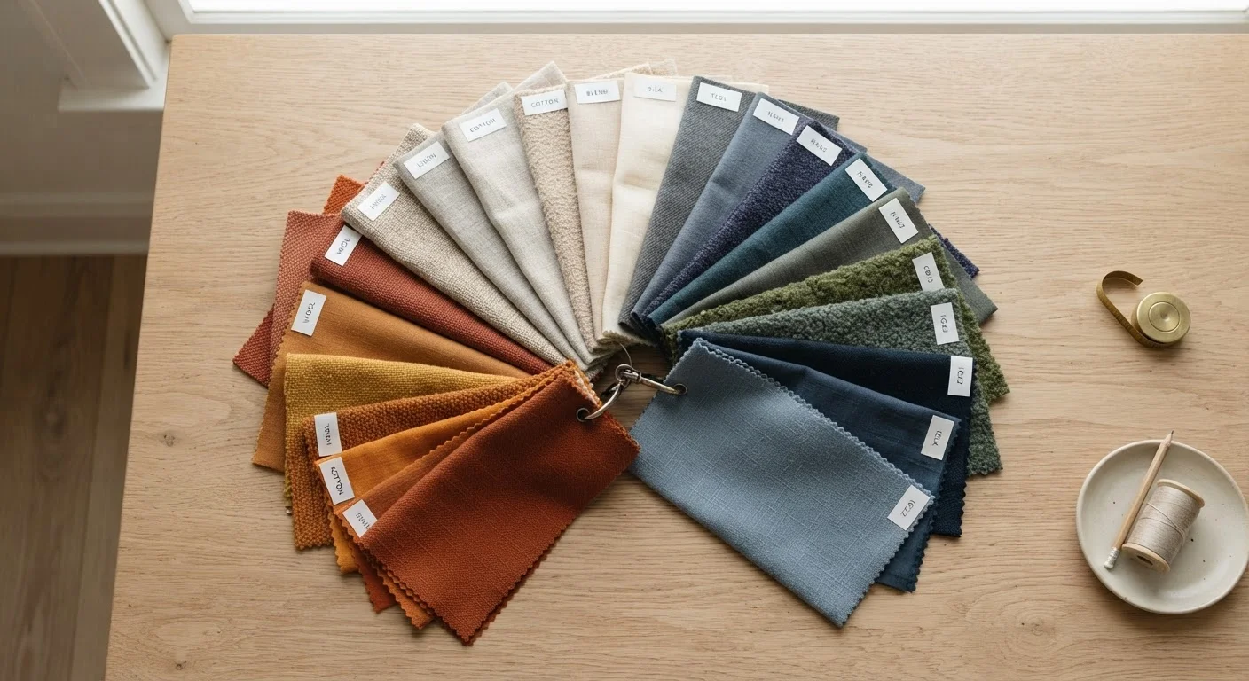
Photo credit: TopInfoTabs.com | Easy Insights For Inspiration
In this article
Learn how undertones, contrast, and colour psychology interact — and how to use that knowledge to choose shades that feel authentically yours.
Key Takeaways
- Your skin's undertone - warm, cool, or neutral - is the single most useful starting point for building a colour palette.
- Contrast level between your hair, skin, and eyes shapes which colour combinations feel most harmonious on you.
- Colour psychology matters: the emotional weight of a shade influences how you feel wearing it, not just how it looks.
- Your personal palette is a living tool - it should evolve with your life, not be locked in by a one-time assessment.
- Trends are optional input, not mandatory instructions; your palette should serve your identity first.
Why Colour Is More Personal Than You Think
Most colour advice falls into two camps: overly rigid seasonal systems that assign you a fixed 'type,' or vague trend roundups that tell everyone to wear the same shade this spring. Neither actually helps you dress in a way that feels true to who you are.
The more useful framework recognises that colour choices are shaped by at least three distinct factors - the physical (undertone and contrast), the psychological (emotional associations and mood), and the contextual (lifestyle, occasion, culture). When these three align, getting dressed becomes noticeably easier and more satisfying.
This is a core piece of the larger puzzle explored in the complete personal style guide, which covers everything from wardrobe auditing to defining your aesthetic long-term. This article zooms in specifically on colour - giving you a clear, step-by-step process to understand and work with your own palette rather than chasing someone else's.
No System Overrides Your Own Preference
Colour analysis frameworks are genuinely useful tools - but they are guides, not rules. If a shade technically 'matches' your undertone but you dislike wearing it, skip it. Style systems exist to serve you, not the other way around. Trust your lived experience alongside any analytical framework.
How to Discover and Refine Your Personal Colour Palette
Before you begin, gather what you need:
What you will need
Work through each step in order - the later steps build on the foundation laid by the earlier ones. If you find yourself wanting to skip the undertone work and go straight to picking colours you love, try to resist: knowing why certain shades work makes it much easier to shop, dress, and adapt confidently later on.
Avoid Assessing Undertone Under Artificial Light
Yellow-toned indoor bulbs can make cool undertones appear warm and vice versa. Always check your skin, veins, and fabric reactions in natural daylight for the most accurate reading. A quick glance under a bathroom light fixture is one of the most common reasons people misidentify their undertone.
Identify Your Skin's Undertone
Undertone is the subtle hue beneath your skin's surface - separate from whether your complexion is fair, medium, or deep. The three broad categories are warm (golden, peachy, yellow), cool (pink, red, bluish), and neutral (a mix of both).
Try these quick checks in natural daylight:
- Vein test: Look at the inside of your wrist. Blue-purple veins suggest cool undertones; greenish veins suggest warm; a mix indicates neutral.
- White vs. cream test: Hold a pure white fabric beside your face, then swap for an off-white or cream. Whichever makes your skin look more alive and even signals your undertone family.
- Sun reaction: If you tan easily and rarely burn, warm undertones are likely. If you burn first, cool undertones are more common - though this is a loose indicator, not a rule.
Assess Your Natural Contrast Level
Contrast describes the difference in depth between your hair colour, skin tone, and eye colour. High-contrast colouring - say, deep hair against a light complexion - generally carries bold, saturated colours and sharp colour combinations with ease. Low-contrast colouring tends to look most harmonious with softer, more blended colour stories.
To gauge your contrast level, take a photo of your face in natural daylight and convert it to black and white. The degree of difference between your lightest and darkest features tells you your contrast category. This directly informs how many colours you can layer comfortably and how saturated those colours can be without overwhelming your features.
Map Your Emotional Response to Colour
Beyond what's flattering in a technical sense, colour carries psychological weight. Wearing a shade you associate with confidence, calm, or joy will read differently in the world than wearing a technically 'correct' colour that makes you feel invisible or uncomfortable.
Spend a few minutes journalling or listing:
- Which colours do you reach for instinctively on days when you want to feel strong?
- Are there shades in your closet that you avoid even though you own them?
- What colours appear repeatedly in spaces, art, or nature that genuinely delight you?
These responses are real data. A colour that energises you emotionally is doing meaningful work, regardless of whether it appears in a seasonal palette chart.
Build Your Core Palette
Using your undertone, contrast level, and emotional preferences as a foundation, draft a working palette of 8-12 colours. A practical structure:
- 2-3 neutrals that anchor your wardrobe and work across seasons
- 3-4 mid-tones that sit comfortably in your undertone family and contrast level
- 2-3 accent colours that reflect your emotional preferences and personal identity
The goal isn't a rigid capsule - it's a coherent reference point. For guidance on balancing neutrals with bolder shades, see this exploration of neutrals versus bold colours.
Test Your Palette in Real Conditions
A palette on paper or screen is a hypothesis. Testing it in real life is where it becomes genuinely yours. Over the next two to four weeks, consciously reach for items in your confirmed palette shades and notice:
- Do you receive more comments about looking well or energised?
- Do you feel more settled and confident in these colours, or are some still not quite landing?
- Which combinations within the palette feel most authentically like you?
Refine as you go. Some initial picks will drop out; others you hadn't considered may earn a permanent spot.
[tool_cards]Revisit and Evolve Your Palette Over Time
Your colour palette isn't a verdict - it's a working document. Life circumstances, evolving tastes, changes in hair colour or lifestyle, and even shifting cultural contexts all offer valid reasons to revisit what you're working with. A palette that felt right three years ago may need an update, and that's a sign of healthy style growth, not failure.
Aim to review your palette annually or after any significant life or aesthetic shift. For broader strategies on building lasting style confidence, the everyday wardrobe confidence guide offers practical daily habits that complement this colour-focused work.
Build a Small Swatch Reference Kit
Cut small squares from fabrics or use paint chips in your confirmed palette shades and keep them in your wallet or phone case. When shopping or getting dressed, these physical references help you stay anchored to what actually works - no guessing required.
Once you have a working palette, you may find it useful to explore how it interacts with your broader wardrobe. Understanding the balance between neutrals and bold colours is often the natural next step - and for anyone who learns visually, mood boarding your palette can help translate these insights into real outfit ideas. You might also find value in exploring lesser-known approaches to developing a distinctive personal style for additional perspective beyond colour alone.

Author
Style & Beauty Editorial Team
Style & Beauty Editorial Team is the collective byline for our editorial team and contributor network. Articles published under this byline or an editorial pen name are researched, written, and reviewed according to our editorial standards for clarity, consistency, and independence before publication.
View all articles →